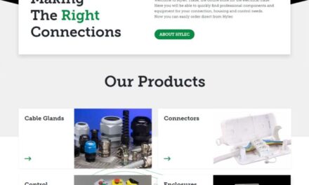
Kemtron, the British manufacturer of EMC shielding and environmental sealing solutions, has launched a new mobile-friendly website in response to the growing demand for information that is easy to view on mobile devices.
The new Kemtron website, utilises responsive design, which means that the page layout adapts to the different screen sizes and formats found on smartphones, tablets, laptops or personal computers. Before responsive design, mobile websites were generally restricted to a limited range of content compared to the versions available on devices with larger screens.
“We recognize that our customers now use their smartphones and mobile devices for a whole range of design, development and sourcing tasks,” said Managing Director David Wall. “We wanted to improve convenience and ensure that they can have unrestricted access to information, wherever they are working.”
The new Kemtron website will continue to feature comprehensive information on EMC shielding and environmental sealing solutions, together with useful practical resources for designers and engineers.
The transition to mobile-friendly website design is essential. In fact, the IDG Global Mobile Survey 2014 found that 92% of executives own a smartphone used for business and 77% of respondents use their smartphone to research a product or service for their business.
A further indication of the growing importance of responsive websites is Google’s planned change in search rankings. Sites that meet mobile-friendly criteria will rank higher on Google, making it easier for designers and engineers to find information in their preferred format.